 Quizstack
Rebeccapurple: The Story Behind CSS's Most Human Color
Discover the touching story behind rebeccapurple, the CSS color named in memory of a six-year-old girl that became the symbol of the new CSS logo.
25/07/2026

Good design often feels like talent—an innate ability some possess and others lack. Refactoring UI dismantles this myth. Written by Adam Wathan, creator of Tailwind CSS, and designer Steve Schoger, the book proves that design is a set of learnable principles, not magical intuition.
Here are eight principles that transform amateur designs into polished products.
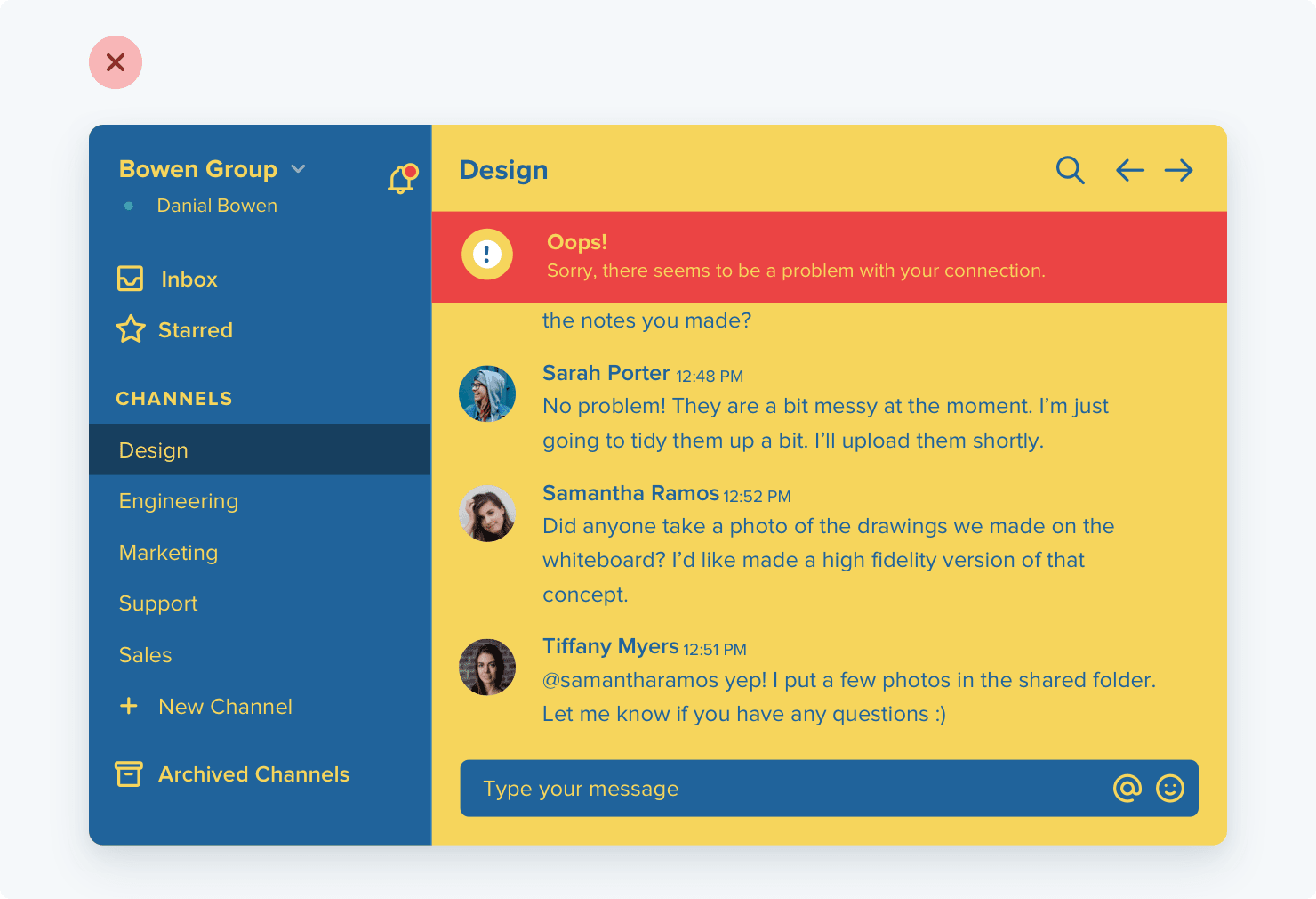
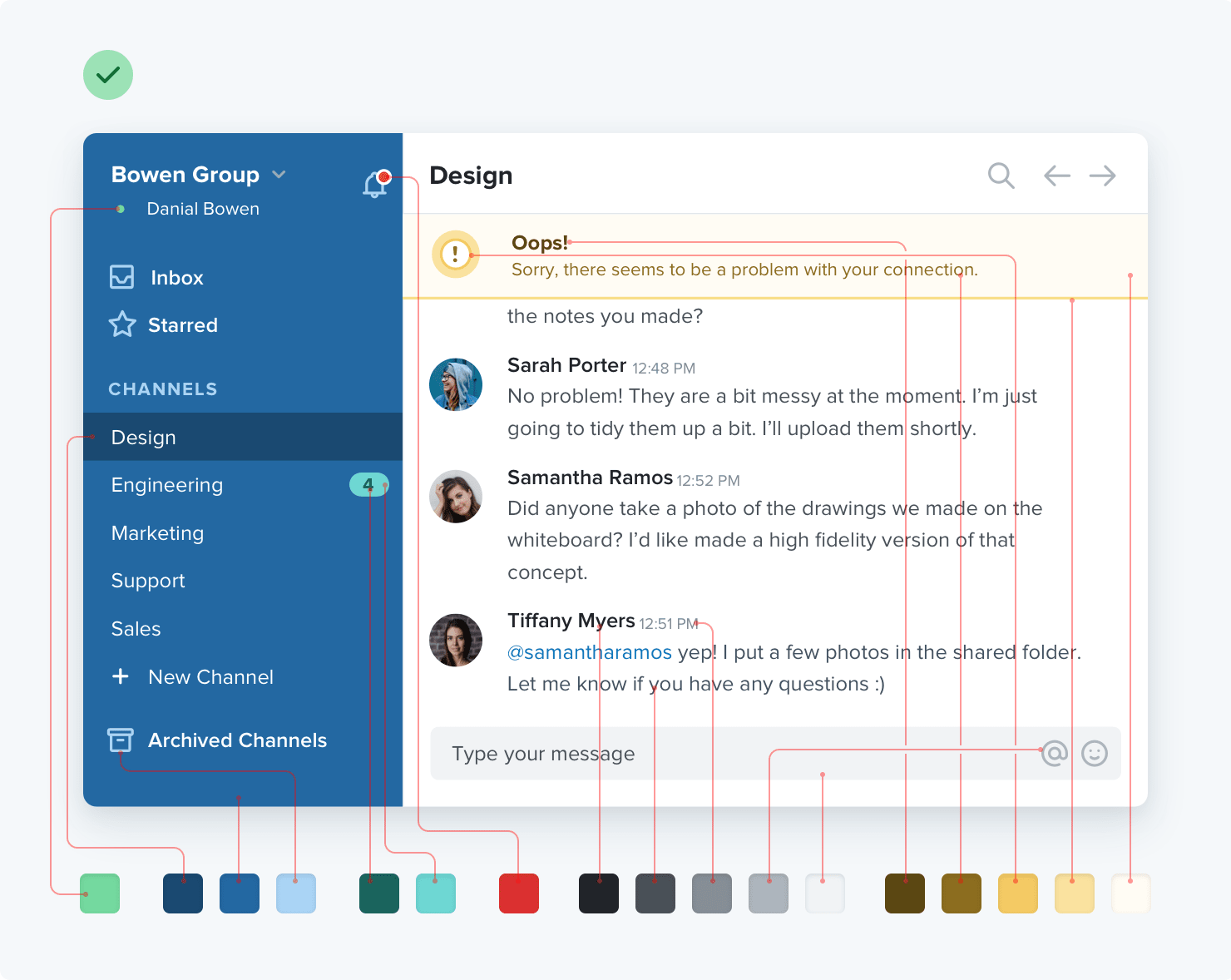
Beginners pick five colors and call it a palette. Professionals build systems with dozens of carefully chosen shades.
Each primary color needs eight to ten variations—from nearly white to nearly black. Your blue isn't one color; it's a spectrum. A button alone needs default, hover, disabled, and focus states. Text, borders, shadows—each demands its own shade.
Building this palette upfront feels tedious. Using it feels liberating. Consistency emerges automatically instead of inventing colors on the fly.
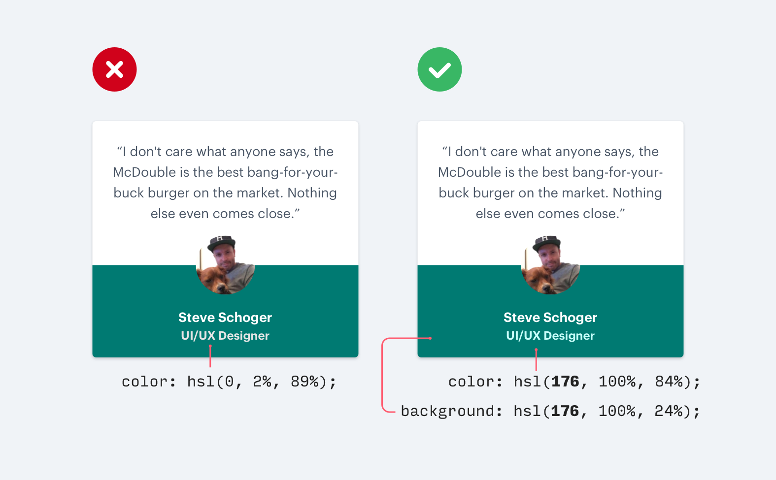
On white backgrounds, grey text creates hierarchy beautifully. On colored backgrounds, this logic fails.
Grey on blue looks dirty, not subtle. The saturation clash creates visual tension your eye notices even if you can't articulate why.
The solution: use the background color itself, adjusted for contrast. On blue, secondary text should be lighter blue, not grey. For light backgrounds, reduce opacity instead—white text at 70% on blue remains harmonious. Grey text at any opacity still looks wrong.

When everything needs emphasis, beginners reach for larger fonts. Headlines grow enormous while body text shrinks. The result: visual chaos.
Size is a blunt instrument. Weight and color are scalpels.
Instead of making a label bigger, make it bolder. Instead of enlarging a number, darken it while keeping surrounding text light. Try designing a card using only two font sizes, creating hierarchy exclusively through weight and color. You'll discover how little size variation you actually need.
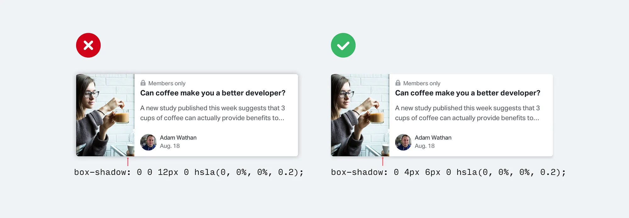
Amateur shadows spread equally in all directions. Professional shadows have direction.
Real-world shadows come from light sources above. A shadow with equal blur everywhere looks like a glow—artificial and flat. A shadow offset downward looks grounded and physical.
The technique: increase vertical offset, minimize horizontal offset, add moderate blur. Something like 0 4px 6px rgba(0,0,0,0.1). Layering a tight dark shadow plus a diffuse lighter one creates convincing depth.
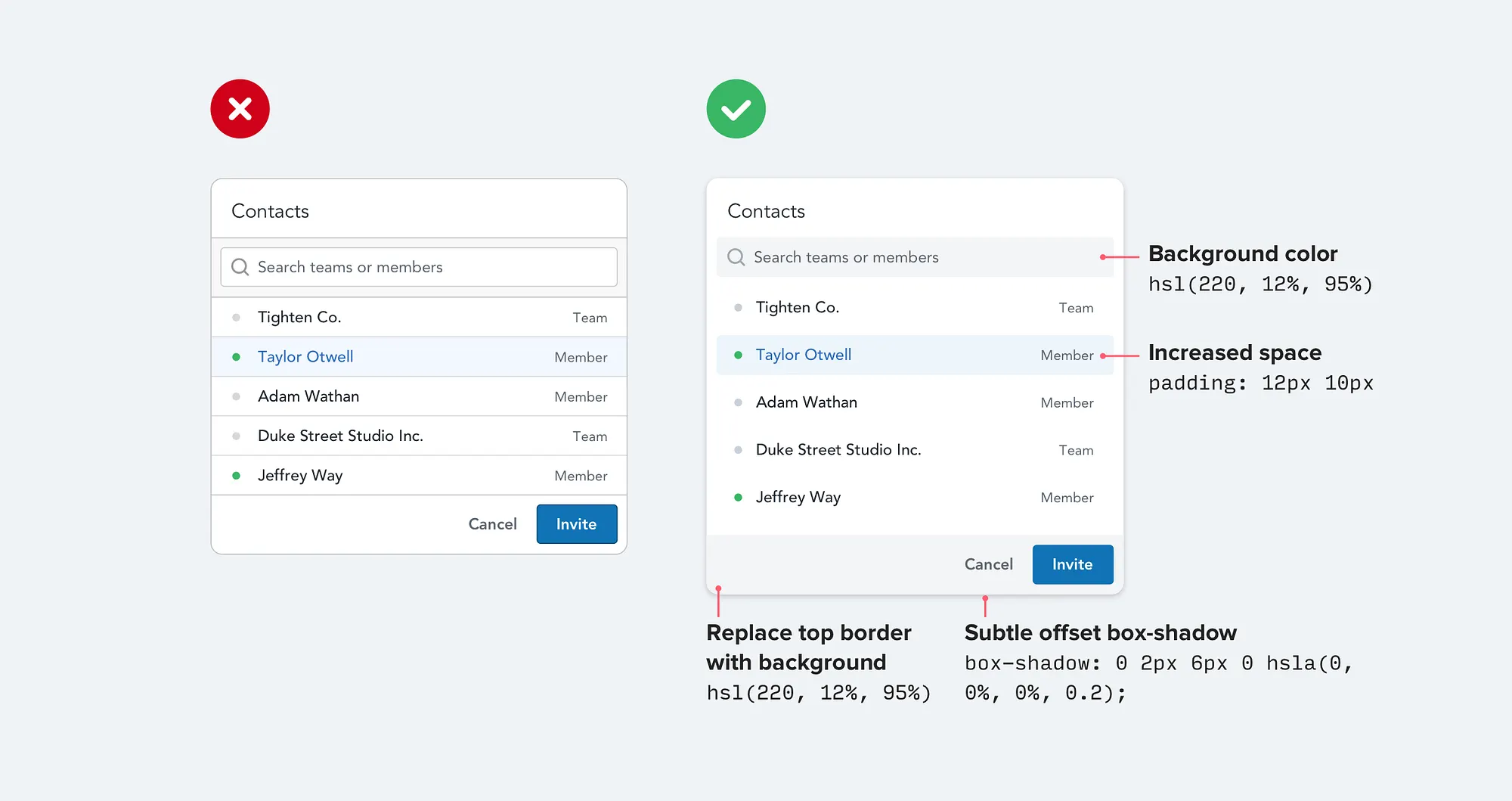
Borders solve problems loudly. Every border adds visual noise. Interfaces accumulate them until they feel cluttered and rigid.
Alternatives exist: box shadows separate without hard edges, background colors define regions softly, extra spacing lets whitespace work.
Consider a list of items. Instead of borders between them, try increased padding. The items separate naturally. When borders are necessary, make them subtle—light grays, thin widths, partial application. Question each border: does it earn its visual cost?

Two adjacent sections need distinction. Borders add noise, shadows imply elevation. Sometimes, different background colors are the cleanest solution.
A white content area on a light gray page. A slightly darker header above a lighter body. Sections separate without explicit boundaries.
The colors needn't be dramatic. Moving from pure white to 2% gray creates subtle definition. Build your gray palette with this use case in mind—you need background grays for layering, not just text grays.
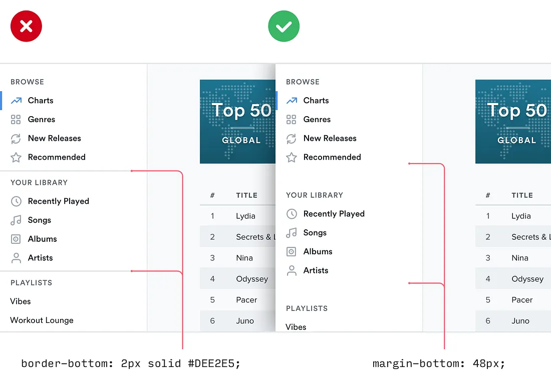
Cramped interfaces feel amateur. Spacious interfaces feel designed.
Whitespace isn't empty—it's functional. It groups related elements, separates unrelated ones, gives content room to breathe. When something feels wrong but you can't identify why, try adding space. Padding inside buttons, margins between sections, line height in paragraphs.
Be especially generous with container padding—cards, modals, sections. Content should never feel pressed against edges.

A 16-pixel icon scaled to 32 pixels looks fuzzy and wrong. Icon designers optimize for specific sizes—stroke widths, details, proportions all calibrated. Scaling breaks these careful decisions.
When you need a larger icon, find one designed for that size. Icon sets include multiple sizes precisely because scaling doesn't work.
If larger icons aren't available, place the small icon inside a larger shape—a circle with a background color. The icon stays crisp while the container provides visual weight.
These rules share a common thread: intentionality. Amateur design happens by default—grey because it's easy, borders because they're obvious. Professional design happens by decision.
Design skill isn't about seeing what looks good. It's about knowing what to try when something looks wrong. These rules provide that knowledge—concrete techniques that elevate any interface.

Discover the touching story behind rebeccapurple, the CSS color named in memory of a six-year-old girl that became the symbol of the new CSS logo.

Discover why useEffect is often overused in React applications and learn cleaner patterns to simplify your components and avoid common pitfalls.
Master the fundamental Git commands and concepts to track changes, collaborate efficiently, and manage your codebase with confidence.
Test your HTML, CSS, JavaScript, PHP, SQL skills and more with free quizzes. Perfect for beginners learning to code or developers preparing for interviews.